Sustainable development, renewable energy, net-zero emissions. Pundits and politicians repeat these eco-friendly terms every day, but how much of a difference are we making towards lower carbon emissions if we follow their suggestions? Green policies sound great politically, but are they making a difference environmentally? In our project, we focus on the United States as a case study and use data visualization to show users possible ways to lower carbon emissions. We also allow our users to explore their personal carbon footprint, so they can decide whether their lifestyles are making an impact on the planet.
Carbon emissions play a critical role in shaping the trajectory of climate change. However, their sources and magnitudes are far from evenly distributed across the globe, resulting in stark disparities that reflect differences in economic development, population size, and energy use.
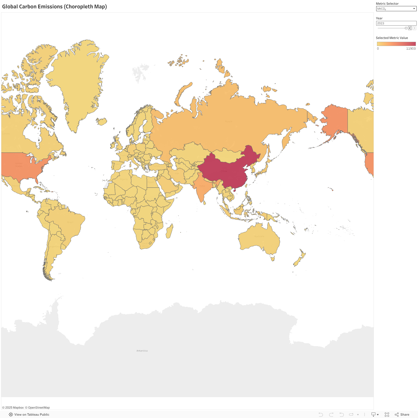
The Choropleth Map on the right provides a country-level view of carbon emissions intensity. By visualizing emissions per capita, per GDP, or total emissions, we can identify patterns that highlight high-emission regions, such as industrialized nations with large populations like China, the United States, and India. Meanwhile, smaller or less industrialized nations often have significantly lower emissions.
Complementing this, the Symbol Map offers us a more granular perspective by using circles to represent emission volumes. The size and intensity of the circles reflect the magnitude of emissions, making it easy to spot major contributors and regional hotspots at a glance.
Together, we can gain a layered understanding of carbon emissions across metrics and time from these visualizations. The interactive time slider enables us to explore trends over decades, showcasing the evolution of emissions and how global patterns have shifted in response to population growth, policy changes, and technological advancements. Also, We can use the Metric Selector to customize the view and uncover deeper insights into the global carbon footprint.
The journey of carbon emissions over time reflects economic shifts, policy decisions, and global awareness.
The line chart can help us track emissions from the mid-20th century to the present, revealing distinct patterns among nations. We can see that the United States, which has consistently been a leading emitter in per capita terms, peaked in 1973 but shows a declining trend in the 21st century. Meanwhile, China’s rapid industrialization in the early 21st century caused a sharp rise in its per capita emissions, eventually surpassing the global average, while India shows a slower but consistent upward trend in per capita emissions. Filters allow a closer look at specific countries or metrics like per capita emissions, enabling a deeper exploration of the factors shaping these trends. Each curve in the chart speaks to the challenges and progress of individual nations.
Carbon emissions are heavily concentrated in a handful of countries, shaping the planet’s climate challenges.
This ranking chart can help us identify the top emitters across different metrics. Countries like Qatar and Curacao lead in emissions per capita, reflecting their energy consumption and economic structure, while nations like the United States and China dominate in total emissions. By interacting with the chart, we can know how industrial growth, resource dependence, and environmental policies influence their standings. This visualization helps us capture the scale of responsibility carried by leading emitters and the pivotal role they play in mitigating climate change.
Generally, there has been an increase in the amount of carbon emissions globally. However, in recent years, countries are also becoming more carbon emission conscious, from the figure we can see that the period from 2003 to 2023 has been the most active in terms of green policies implementations worldwide.
From the early 1950s to current day, the USA has become the biggest implementer in carbon policies. Among the types of policies proposed, "Government spending for low-emissions and efficient transport, Incentives and investments" and "Government spending in low-carbon electricity, Incentives and investments" were the most commonly proposed policy types. Next we’ll dive in a bit deeper to examine whether the policies proposed by the USA has had a significant impact on its carbon emissions.
From this figure we see that the period from 2005 to 2020 is where the USA has been the most active in proposing and implementing green policies. It was also during this period that we see the transportation sector has a significant drop in CO2 emission and the electric power sector’s carbon emission leveling out. The industrial, residential, and the commercial sector did not witness any significant changes in carbon emission even in the period of active green policies implementation. This suggests that the USA green policies primarily target the transportation and electric power sectors and from the chart it seems like the policies are working for these two sectors.
Similarly to the last figure, this time let's take a look at how the green policies in the USA impact the consumption of coal, natural gas, and petroleum. From the chart, we see that from 2005 to 2021, coal consumption has decreased significantly but the consumption of natural gas has gone up and petroleum is staying relatively the same. This makes sense since natural gas releases significantly less CO2 compared to coal. This switch from coal to natural gas is a direct result from the policies implemented by the USA, mainly in the transportation and electrical power sectors.
Around 2004, the carbon emissions produced from the consumption of petroleum and coal started to reduce, whereas the carbon emissions produced from the consumption of natural gas began to increase. Therefore, we further explored the percentage change of carbon emissions of each state by fuel type.
The three hex maps reveal that most states opted to switch from petroleum and coal to natural gas. Coal, in particular, was phased out by many states. However, it is worth noting that carbon emissions are not drastically decreasing because of less consumption. Instead, the decrease is likely attributed to a different and slightly more “cleaner” type of fuel (natural gas) being consumed.
In recent years, the car industry has advocated for a new switch: the switch from conventional fossil fuel cars to electric vehicles. The argument for electric vehicles is they have a lower carbon footprint than fossil fuel cars. The following two charts demonstrate the comparison of the percentage change in the number of registered electric vehicles, fossil fuel vehicles, and transport-related emissions in the 50 states and DC from 2016 to 2022. Surprisingly, all 50 states and DC have increased the number of registered electric vehicles, but not all of them have seen a decrease in transport-related emissions nor registered fossil fuel vehicles during the same time period.
As of 2024, 24 states and DC have pledged to achieve 100% clean energy goals. We decided to color them green and the other 26 states red. We expected green states to have more registered electric vehicles (more green dots at the top in the left chart) and less registered fossil fuel vehicles than the red states (more red dots at the top in the right chart), but were surprised to find the absence of a clear distinction between the two types of states. In fact, the majority of the green states increased their number of registered fossil fuel vehicles, though some managed to decrease their transport-related emissions during the same time frame. Although we do see more green states to the left of the charts, indicating that they have reduced their transport-related emissions from 2016 to 2022, we should be aware that “the COVID effect” has almost always been present throughout our emissions charts, namely a dip followed around a bounceback in the years 2019–2022. In fact, time is so relative in charts that it could be deceptive. If we looked closely at the carbon emission by fuel type chart, we would notice that both the carbon emissions based on the consumption of petroleum and fuel have increased since 1970. Although the carbon emissions based on the consumption of petroleum has decreased since 2004, it has not returned to the 1970-level.
Americans have the highest per capita CO2 emissions out of anyone else in the world. On average, Americans produce 14.45 metric tons of CO2 annually, which is over 3 times the global per capita of 4.53 metric tons. Looking at this breakdown of the average American’s carbon footprint, we can see that transportation and housing make up over half of our yearly emissions. Americans have a strong reliance on personal car transportation, which, although improving with the adoption of electric vehicles, still requires the burning of a lot of fossil fuels. Some of these emissions we can directly control, like the direct fuel used for driving or the electricity used for keeping our homes warm in the winter. Others, like CO2 produced by our foods, are more indirect and result from the production and transportation of such goods.
Since electricity is also a huge contributor to our annual emissions, let’s look at what all that power may be getting used for on a day-to-day basis. Here we can see the average annual carbon footprint of various electronics and household appliances that you likely have in your home. Interestingly enough, electric stoves and ovens are actually more environmentally harmful than stoves and ovens that use natural gas! We can also see that LED light bulbs produce much less CO2 than incandescent bulbs, plus they last much longer. The two appliances that use the most power and produce the most CO2 by far are your refrigerator and heating/cooling system, which annually produce 311 and 320.6 kg CO2 respectively. While you definitely can’t go without these two appliances, maybe try lowering the thermostat in the winter to reduce the electricity needed to heat your home.
Another factor that significantly correlates to your individual carbon footprint is the size and income of your household. The average annual amount of CO2 emissions increases with household size and income. However, when looking at the individuals within the households, larger households always produce less emissions per capita. While you can’t control your income level, living with more people (such as roommates or family members) can help reduce your carbon footprint and likely save you money on your electricity bill.
Here are some additional ways you can help reduce CO2 emissions in your day-to-day life. Once you’ve considered these options, click on the button to the right of the bars.
It would take over 6800 people swapping out half of their home’s lightbulbs to LEDs to offset the emissions created by Taylor Swift’s private flights in 2022. This goes to show that the vast majority of carbon emissions are out of the typical individual’s hands. Studies have found that the wealthiest 1% of the global population produces roughly the same amount of CO2 emissions as the poorest 66% of the population. Additionally, the top 1% is responsible for around 16% of global CO2 emissions.
In the face of escalating climate change, our project explores the current state of carbon emissions
and examines how policy, technological innovation, and societal shifts can effectively reduce carbon
footprints. Overall, annual global carbon dioxide levels continue to rise at a steady rate. However,
positive
changes have been made by many countries to reduce their emissions, including the US, with the
adoption
of
varying green policies. Most of the US's green policies are related to trade and energy regulations,
while
very few are targeted towards the residential sector. Furthermore, individual carbon footprints,
even in
the US, have a relatively minimal effect on the overall global CO2 levels in the face of the top 1%
and
global
trade and energy needs.
This highlights that reducing carbon emissions requires more than just isolated efforts from
individual
countries or people. To achieve meaningful emissions reductions, a more collaborative global
approach is
necessary, with stronger international policies and faster adoption of clean energy. Additionally,
while
your individual lifestyle changes might have a small impact, adoption of such changes on a large
scale
may
see significant results. With the looming threat of global warming, you must ask yourself if this is
a
cause
worth dedicating your efforts towards, no matter how small.
Data and information in Overview of Global Carbon Emissions section is sourced from the Global
Carbon
Atlas, which provides carbon emissions data
aggregated by country and region. For this part, three datasets from the source was processed and
merged to highlight
global emission trends using three metrics.
Click Here to Download the Processed and Merged Dataset for Global Carbon Emissions